
Key Takeaways: The Anatomy of a Whimsical Character
Grab your favorite markers and let's get colorful. Whimsical design relies on pushing proportions and embracing imperfections, but it requires a solid structural foundation. Workshop experience shows that the most successful characters emerge from a proven, fixed order. You start with the personality hook, establish the dominant shape, lock in the emotional color read, and only then apply surface texture. This sequence keeps the design from becoming a chaotic mess.
A practical first-pass design session breaks down into three distinct blocks over one to three days. Dedicate 20 to 35 minutes for concept notes, 45 to 90 minutes for sketch exploration, and 45 to 120 minutes for color and texture testing. Rushing this timeline often leads to generic results.
Before calling the design successful, evaluate it at three specific sizes. Check a tiny digital thumbnail at 96 to 160 pixels tall to ensure the silhouette reads clearly. Next, review a mobile-view image at 360 to 430 pixels wide. Finally, run a small print test around 5 by 7 inches to verify your ink saturation and detail clarity.
Brainstorming and Finding the Whimsy
The blank page is intimidating—but the solution is treating the character as a story problem rather than a drawing problem. Identify what the character wants, what makes them odd, and what visual object or habit shows that oddness. Think of a bear who loves baking, or a bird afraid of heights.
Before opening your sketchbook, create a mind map. Write down 12 to 20 trait words, 5 to 8 object associations, and 3 to 5 action verbs. If your character is a baker bear, your trait words might include clumsy, enthusiastic, and floury. Next, gather 6 to 10 reference photos to ground the fantasy in reality. You might pull inspiration from historical American illustration archives or modern photography. You need at least 3 images for anatomy or posture, 2 to 4 for costume or props, and 1 to 3 for texture cues like fur, fabric, or frosting.
Keep this ideation window tight to prevent over-research. Spend 20 to 45 minutes for a simple blog illustration or printable character. If you are developing a character intended to become a recurring mascot, extend that research phase to 60 to 120 minutes.
Sketching and Pushing Proportions
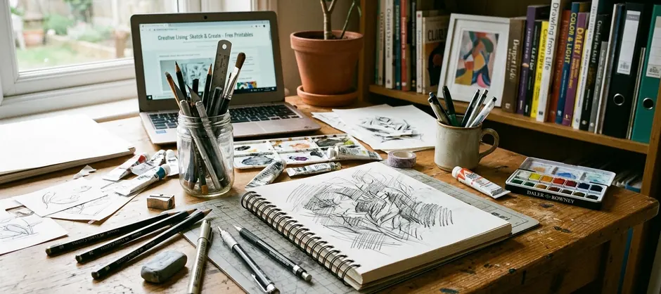
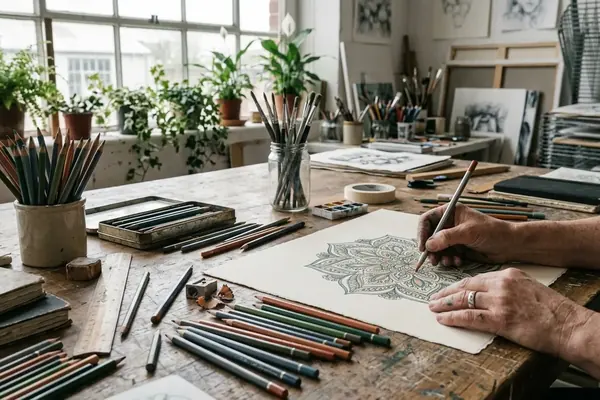
Sketching begins with fast gesture thumbnails so the pose carries the mood before facial details appear. Produce 12 to 24 thumbnails at 2 to 4 minutes each. Use simple circles, beans, triangles, and stick-limb gestures rather than finished linework. This rapid generation forces you to explore dynamic stances instead of settling for the first idea that comes to mind.
Select 3 to 5 of these thumbnails for a second pass. Redraw each at least two times with one proportion changed. You might alter the head-to-body size, limb length, eye spacing, or accessory scale. Exaggerating specific features enhances the whimsical feel. Avoid perfect symmetry, as slight imbalances make characters feel more approachable and alive.
Finally, run a silhouette check. Fill the sketch with black and view it at 2 to 3 centimeters tall on paper or 80 to 120 pixels tall on screen. If the shape is unreadable, the pose needs pushing.
Selecting a Playful Color Palette
Treat color selection as an emotional sorting step. Palettes should evoke emotion rather than strict realism. Limiting your palette is a guaranteed way to prevent visual clutter. Restrict the main palette to three or four colors: one dominant body or clothing color, one support color, one neutral, and one accent if the focal point needs help.
Incorporate unexpected accent colors to draw the viewer's eye to key features like rosy cheeks or the bright tip of a tail. Test 6 to 12 color thumbnails before the final render. Use the exact same sketch for these tests so the comparison is purely about color mood rather than drawing quality.
Spend 15 to 30 minutes on color thumbnails for a single character. Extend that time to 45 to 75 minutes when the character must match a printable set, sticker sheet, or seasonal art collection.
Quick Tip: In collaborative projects, testing colors on a tiny canvas prevents you from getting lost in rendering details too early, though this depends heavily on the complexity of the character's outfit.
Adding Texture and Finalizing the Design
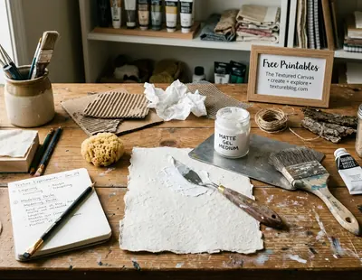
Texture adds necessary warmth to digital or traditional illustrations. Apply texture only after the flat color reads clearly. The final pass focuses on evidence of personality. You might add freckles for a shy child character, uneven pencil grain for a cozy woodland animal, or clothing patches to build character history.
If you combine traditional media like watercolor washes, colored pencil grain, crayon marks, or cut-paper fibers with digital flats, scan your handmade texture sources at 300 to 600 dpi. A typical digital file on your Wacom tablet should use 2 to 5 texture layers. Set up one broad paper or wash layer, one mid-level material layer, and one to three small detail layers for marks, fibers, scuffs, or highlights.
Reserve 45 to 90 minutes for the final detail pass on a single character. Once finished, recheck the silhouette at 64 to 128 pixels tall before exporting to ensure the core shape remains readable under all those lovely details.
Understanding the Limitations of Stylized Art
Highly stylized proportions do not translate well to strict anatomical diagrams, technical instruction art, or medical-style illustration where measurement accuracy matters more than charm. Over-exaggeration can obscure the intended emotion if not balanced carefully. For example, oversized eyes, a tiny mouth, and raised eyebrows can make a supposedly mischievous character read as frightened or startled. You must check the expression against the intended trait before final color.
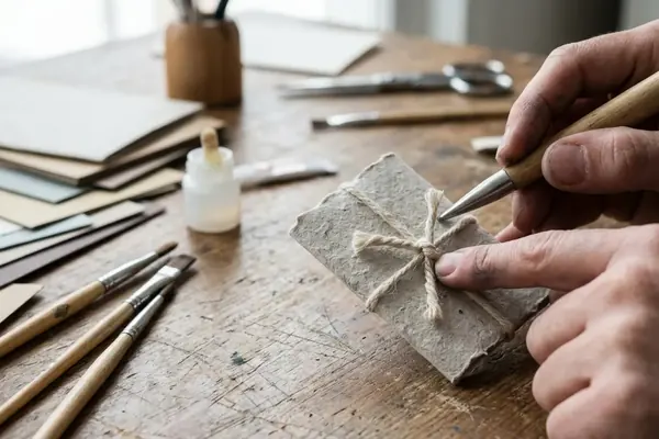
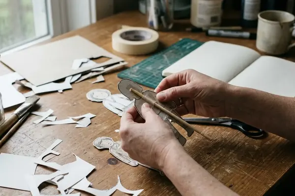
The cleanup decision asks which details communicate the original personality hook and which merely decorate the drawing. Keep 1 to 3 signature details in the final simplified version, such as one distinctive hat, one memorable prop, and one facial feature. Recognize when a design becomes too complex and scale back.
Context dictates the final form. A character designed for a kids' coloring printable, perhaps inspired by educational materials developed by Sesame Workshop over their multi-year broadcast history, needs larger enclosed shapes and fewer texture marks than the same character designed for a blog header or greeting card. Simplify narrow details that would print smaller than roughly 0.5 millimeters line spacing, as these create enclosed areas too small for crayons or markers. Schedule a 20 to 40 minute reduction pass after the first finished render to maintain the core whimsical charm across different formats.
Note: Process documentation supports the idea that scaling back complexity actually strengthens brand recognition across diverse media formats.
Summary: Whimsical character design is a structured process of pushing proportions, limiting color palettes, and applying purposeful texture while respecting the practical limits of stylization.


Join the Conversation
Nothing here yet. Add your opinion.
Add Your Thoughts