
Key Takeaways for the Digital Transition
Moving from a physical easel to a digital workspace requires a deliberate strategy. The transition plan starts by separating what must be preserved from what can change. You keep your freehand drawing skills, color judgment, and character style as the absolute non-negotiables. You change the mechanics of sketching and delivery.
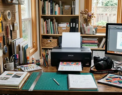
A practical first setup uses a pressure-sensitive Wacom tablet mapped to one monitor. Tie your brush-size control directly to pen pressure, and assign undo/redo to two easily reached keys. This configuration minimizes the friction between your brain and the screen. Workshop experience shows that a structured first digital transition sprint yields the best results. Commit to 10-15 drawing sessions across 3-5 weeks. Limit each session to one specific task: line control, flat color, digital blending, texture overlays, or export cleanup.
To measure your progress, compare one finished acrylic piece and one finished digital remake. Check the line weight, edge softness, and color palette. Most importantly, verify whether the character silhouette still reads clearly at thumbnail size.
Summary:
- Photograph or scan 6-12 older acrylic pieces before building digital brushes.
- Map the tablet to one monitor and set pen pressure to control brush size or opacity.
- Spend 7-10 short sessions on line and pressure drills.
The Catalyst for Moving Beyond the Canvas
The move beyond canvas is usually triggered by production pressure rather than a lack of love for paint. Once an illustrator has to revise colorways, resize art, and send clean files to clients, the decision to digitize becomes a survival mechanism. We can trace this evolution by looking at early physical collections.
Consider a collection that began as paintings in 2004 and was publicly presented in early 2006, like the Fruit and Nuts series. That 18-26 month span serves as evidence of a slower physical-production cycle. Compare that historical pacing with the 1-5 business day revision cycles common in modern commercial illustration handoffs. The demands of the industry simply outpaced the drying time of acrylics.
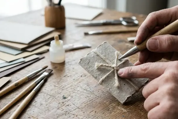
If you have a physical archive dating from 2004-2007, scan or photograph 6-12 representative pieces before you even attempt building digital brushes. You need these so your new digital marks can be compared against actual earlier linework and color choices. Archive each physical reference meticulously. Record the title, medium, approximate dimensions, completion month if known, exhibition or sale status, and capture a close-up image of the brush texture.
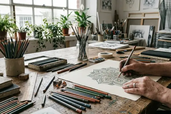
Replicating the Brush: Mastering Freehand Digital Drawing
Skill transfer happens in distinct stages. First, you train the hand to draw while watching the screen. Next, you rebuild brush behavior. Only then do you attempt a finished illustration. The decision sequence dictates the final quality of the work.
Start with 7-10 days of 20-30 minute drills. Practice straight lines, C-curves, S-curves, circles, hatching, and pressure ramps from a hairline to a heavy stroke. Use a canvas file between 3000 and 5000 pixels on the long side at 300 ppi for practice pieces intended to print cleanly at common art-print sizes. In collaborative projects, this resolution provides a solid balance between detail retention and system performance.
For acrylic-like blending, test three brush behaviors separately: low-opacity layering, wet-edge smearing, and textured dry-brush strokes. Keep the winning settings in a named brush folder instead of adjusting from memory each time. Turn off excessive stroke stabilization during early drills, then reintroduce light stabilization only after the hand motion feels predictable.
Note: An acrylic painter may produce stiff tablet drawings if the software stabilizer is set so high that natural hand wobble, pressure variation, and quirky line personality are erased.
Scaling Commercial Work with Digital Tools
Commercial scaling depends on deciding which parts of the drawing need to remain handmade and which parts need to become editable assets. The usual choice is to keep concept sketching and expressive lines organic, while standardizing fills and backgrounds. The right file structure depends on the job; apparel graphics need layer separation and fast recoloring, while gallery prints require entirely different preparation.
A clean apparel-art file commonly needs separated layers for line art, fills, shadows, highlights, background, and optional lettering so a buyer can request color changes without redrawing the illustration. Executing high-profile commercial projects for retail partners like Forever 21, or delivering precise digital assets for major design clients including the Charles Schulz Museum, musician Ringo Starr, and educational organizations like Sesame Workshop, requires rigorous file hygiene.
For retail or licensed-art review, prepare exports in at least two forms: a flattened preview image for approval and a layered production file with clearly named groups. A practical turnaround structure is 1-2 business days for rough concepts, 2-4 business days for approved final art, and 1-2 business days for post-approval color or placement revisions, depending on client feedback speed. Before delivery, inspect the design at full size and at thumbnail size. Apparel graphics often fail when the face, hand gesture, or lettering disappears after being reduced.
Exhibiting Digital Work in Traditional Gallery Spaces
To move digital work back into a gallery setting, you have to make print decisions before framing decisions. First confirm final pixel dimensions and color space, then make a small proof, then commit to the full run. Transitioning gallery presence from early physical venues like Chango Coffee House to modern hybrid shows requires a shift in logistical thinking.
For a gallery print, finish the master file 21-35 days before the opening window. This buffer ensures there is time for proofing, reprint corrections, framing, labels, and delivery. Prepare a wall label for each piece with title, year, medium description such as digital illustration printed on archival paper, edition status if applicable, and price or collection status.
Reflecting on the logistics of solo show opening receptions, drawing from experiences like the December 2007 exhibition at the Cactus Gallery, timing is everything. For a reception scheduled on a Saturday evening in mid-December, complete framing no later than the preceding Monday-Wednesday range to leave time for transport or hanging problems.
Quick Tip: A digital file that looks bright on a backlit screen can print too dark if no proof is made before framing or client delivery. Order one proof print at the intended paper type before committing to the full set. Check saturated reds, dark outlines, and pale skin or background tones under indoor light.
Scope and Limitations: What a Tablet Cannot Replace
The limitation decision is not whether digital is better or worse; it is which collector and creative values are being served. Tablet work wins when the job requires editable layers, fast recoloring, and rapid distribution. However, there is a real loss of tactile feedback and physical texture inherent to acrylic paint.
Acrylic originals carry observable surface evidence: raised paint edges, canvas tooth, varnish sheen, small corrections, and side-edge paint marks that cannot be fully duplicated by a flat print. The unique collector value of original physical pieces, such as the painting owned by Courtney Cox-Arquette, relies heavily on this material presence. If a collector bought or received an original painting during the 2000s, the object value includes the actual painted surface and chain of custody, not just the image.
Digital originals should be managed as master files with dated versions, export copies, print proofs, and licensing records. Physical originals need condition photos, dimensions, medium notes, and ownership history. One catch remains constant—a tablet can reproduce the look of layered paint for print or web use, but it cannot provide the same physical surface, object history, or one-of-one material presence as acrylic on canvas.
Continuing the Creative Journey
A sustainable mixed-media practice is built by assigning each medium a job. Reserve acrylic for tactile originals, experiments, and collector pieces. Use tablet drawing for client work, printables, licensing, and rapid iteration. Integrating both digital and traditional methods into a cohesive portfolio requires ongoing maintenance.
Maintain a quarterly review cycle. Choose 3-5 acrylic pieces and 3-5 digital pieces from the previous 12-16 weeks, then compare palette, line personality, subject matter, and finish quality. Assuming consistent lighting conditions during your review, this practice highlights where your digital work might be drifting from your core style. Keep a shared visual library with scanned sketches, photographed paintings, exported digital finals, brush presets, texture samples, and client-ready templates.
My process documentation supports the idea that sharing the journey builds audience trust. For blog or portfolio publishing, document each hybrid project with 4-6 process images: sketch, tablet linework, color block-in, texture pass, final export, and optional printed result. Insights from artist and author Steph Calvert reinforce that maintaining creative momentum relies on this balance of rigorous technical process and joyful, messy experimentation.
Join the Conversation
Nothing here yet. Add your opinion.
Add Your Thoughts