

At 4 PM, the Craft Table Told the Story
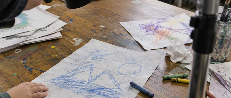
At 4 PM on a Tuesday, a wooden library table held the aftermath of an afternoon rush: broken crayons, crumpled sheets, finished drawings, and untouched prompts. Some pages had clearly earned a trip home. Others carried one uncertain scribble before their young artists moved on.
The divide offered a practical verdict for printable designers. Visually obvious prompts held attention better than written directions, low-ink line art was easier to keep stocked, and designs without age labels welcomed a broader range of children.
These were free printables in a public, unstructured setting. Families used them while waiting between book checkouts and scheduled story times, often with adults dividing their attention among children, bags, books, and the checkout desk. Nobody stood beside the table to explain the activity or demonstrate the first step.
Selection Was Only Half the Evidence
The station revealed two separate behaviors. Stack depletion showed which pages families picked from the tray. The physical condition of pages left in the recycling bin showed which activities children continued after that initial choice.
That distinction matters. A polished printable can attract a parent without giving a child enough reason to make a second mark.
The observation window ran from page selection during the Tuesday afternoon rush through the recycling-bin review later that same service day. It did not produce a controlled completion metric, yet it exposed something sales previews rarely show: how a design behaves after it leaves the screen and lands beside a cup of stubby crayons.
Tray-Side Verdict
A successful community-table printable explains its first action through the artwork itself. If the child has to wait for an adult to decode the page, the activity has already lost its grab-and-go advantage.
The completed sheets tended to share a generous visual structure. A large shape invited an obvious addition. Open white space left room for decisions. The child could start anywhere without worrying about doing the steps in the correct order.
The abandoned sheets asked for more preparation. Some required reading. Others presented so much detail that a single crayon felt inadequate. At a busy library table, those tiny points of friction accumulated quickly.
Three Kinds of Printables Shared One Tray
The library needed an activity that could run without a facilitator. This form of passive programming had to occupy children while adults checked out books, waited for story time, or managed more than one child.
Staff stocked three distinct printable formats in the same station:
- Detailed coloring art with intricate patterns and the visual density often associated with adult coloring pages
- Step-by-step drawing tutorials that paired multiple stages with paragraph-length instructions
- Open-ended line prompts built around one large shape and a short invitation, such as adding a face to a monster
Placed together, the tray became a practical comparison of complexity. Every format looked plausible in a digital preview. Each one also promised a different kind of value: patient coloring, structured learning, or imaginative play.
The Station Favored Immediate Decisions
The surrounding environment shaped how those promises played out. This was a waiting area rather than a dedicated art class. Children could arrive midway through a sibling’s checkout, hear that story time was about to begin, or discover that the crayon cup contained plenty of brown and no blue.
A dense coloring page asks for time, color choice, and persistence. Drawing lessons add reading and sequence. The monster waiting for a face asks one cheerful question: what should this creature look like?
That last format fit the moment. The child could understand it while reaching for a crayon.
The context sets an important boundary around the findings. The station observations describe brief use in a public waiting area where parental supervision was divided. They should not be treated as measured outcomes for guided classrooms, home lessons, or adult coloring sessions. A detailed page may thrive during a quiet hour at the kitchen table and stall during a seven-minute library wait.
Complexity Was More Than Line Count
A page can contain many lines and still communicate clearly. A Wacom tablet sketch of a busy robot, for example, might remain approachable if one empty speech bubble supplies the obvious first action. Meanwhile, a sparse tutorial can feel demanding when the child must read a paragraph before drawing.
The useful design question is therefore broader than “Is this page simple?” Designers need to ask what the page requires before the first mark: reading, counting, choosing among tools, locating step one, or waiting for an explanation.
At this station, the strongest format reduced those prerequisites. One large visual idea carried the activity.
Parents Picked Lessons; Children Finished Prompts
The most revealing gap appeared between adult selection and child follow-through.
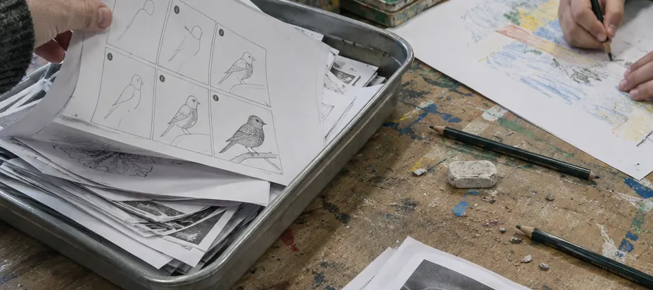
Parents frequently reached for the educational-looking drawing tutorials. Their choice made sense. A numbered lesson suggested structure, skill development, and a clear finished product. In a tray of free activities, it looked substantial.
Yet those same pages repeatedly appeared in the recycling bin with only an initial scribble or no meaningful drawing. The open prompts followed a different path. Sheets with one large shape or one short sentence were more often completed and taken away rather than discarded.
Refills Measured Interest, Not Engagement
Staff watched which stacks needed replenishment during the service day. Relative depletion provided a useful signal of initial appeal, but it could not show whether the page sustained attention.
The end-of-day bin review supplied the missing half. Blank sheets and minimally marked tutorials indicated that a family had selected the page without carrying the activity very far. Completed drawings disappearing into tote bags left a different physical trace: the stack went down, and the work did not come back.
Together, tray depletion and recycling-bin marks separated adult intent from child behavior. The method remained observational and qualitative, but the contrast was visible enough to guide a design audit.
Open Prompts Gave Children Ownership
A step-by-step lesson points toward one expected result. That can help when a child specifically wants to learn how to draw a cat, spaceship, or cupcake. At a shared craft table, the same structure can make every skipped step feel like an error.
An open prompt changes the emotional job. A monster can have three eyes, roller skates, a crown, or a tiny pet sandwich. The large starting shape removes the fear of the blank page while preserving room for an original answer.
This balance explains why low friction does not have to mean low creativity. The designer supplies a sturdy launchpad and then gets out of the way.
For creative businesses, the selection-completion gap also has a commercial parallel. A thumbnail may persuade an adult to download a printable because it looks educational or impressively detailed. The real test begins after printing, when a child decides whether the page feels inviting. A product library evaluated only through clicks or downloads can miss that final piece of behavior.
Paragraphs Put the First Mark Too Far Away
The abandoned tutorials shared one demanding feature: they began with a reading task.
Before drawing, the child had to locate the opening instruction, decode a paragraph, connect it to a small example, and remember the sequence. That process may seem modest at a desk. At a public craft station, it competes with conversation, movement, announcements, and the possibility that the family will leave at any moment.
Children came to the table to make something. A manual delayed the satisfying part.
Age Labels Added a Social Obstacle
Printed age ranges introduced another layer of judgment. An older child could dismiss an appealing activity after seeing a label that made it feel “too babyish.” A younger child might choose a page assigned to an older group and then encounter instructions beyond current reading ability.
The label tried to clarify suitability, but the visual design already communicated much of that information. Line scale, subject matter, required precision, and the number of steps all signaled difficulty without placing the child inside a category.
Removing an unnecessary age band lets the user make a quieter decision: “Does this look fun?”
Let the Page Demonstrate the Action
Visual cues can replace most prose at the point of use. The best cue depends on the activity:
- Use dashed contours when the child should trace or complete a missing section.
- Add arrows when direction or movement matters.
- Show small sequential pictures when several stages must occur in order.
- Leave a clearly framed blank area when the child should invent an object, expression, or scene.
- Keep any necessary sentence close to the relevant drawing rather than isolating it in a block of text.
These devices shorten the distance between seeing and doing. They also make the printable more accessible to emerging readers and families who do not share the language used in the instructions.
First-Mark Test
Set the page down without explanation. If the intended action remains unclear after three seconds, revise the visual hierarchy before polishing the wording.
A good test uses the rough conditions of the final setting. Print the page, place it on a table, and approach it standing up with one crayon in hand. That setup exposes tiny step numbers, weak arrows, and instructions that looked perfectly readable while zoomed in on a monitor.
Dark Borders Quietly Drained the Supply Shelf
Some printables failed before a child ever saw them. Their problem appeared at the printer.
Solid dark backgrounds, broad black borders, and dense preprinted shading can create striking artwork on a backlit screen. A community printer interprets those features as large fields of toner. Every refill decision then carries a production cost that the digital preview hides.
Staff began passing over the heavy-ink designs when restocking the activity tray. Parents showed similar hesitation about taking pages home to reproduce. The subject matter was not the issue; the dark coverage was.
White Space Does Two Jobs
Reducing ink demand does not require making the illustration dull. Thin outlines can still carry expressive characters, playful props, and a clear focal point. Selective detail often reads better in black and white because the child can see where personal marks belong.
White space also becomes creative territory. A blank background can turn into a moon base, an underwater school, or a very fancy grocery store. Preprinted shading makes that decision in advance.
For the library station, preserving dramatic dark styling was not worth reducing the number of usable copies. Revising the art toward open interiors, lighter borders, and fewer filled areas improved both reproduction and play value.
Audit Ink Before Exporting the PDF
A quick grayscale preview helps, but a physical laser print tells the fuller story. Designers can review each page in this order:
- Convert or print the artwork in black and white.
- Look for solid fields that cover large areas without serving the activity.
- Compare the outer border with the interior line weight.
- Remove decorative shading that a child could add independently.
- Check whether thin details remain visible on ordinary paper.
- Run the sheet through the intended printer and watch for toner buildup or paper-feed trouble.
This audit catches a common mismatch between illustration and product design. A rich digital composition can be beautiful artwork while remaining awkward as a reproducible handout. Printable design has to account for the machine, the paper, and the supply cabinet alongside the image itself.
That constraint can sharpen the work. When every black area needs a reason, silhouette, expression, and line rhythm carry more of the personality.
The One-Crayon Audit for Printables in the Wild
A printable library should be reviewed from the physical use case backward. The glossy product mockup comes later. First comes the child standing at a shared table with limited time and whichever crayon survived the afternoon.
Start With the Real Output
Designers can use a compact audit for files intended for libraries, classrooms, waiting rooms, and busy households:
- Print in standard black and white. Confirm that the focal point survives without color, textured paper, or a high-resolution display.
- Find the first action. The place to begin should be obvious before anyone reads a paragraph.
- Remove reading-dependent steps. Replace explanatory prose with dashed lines, arrows, or a short picture sequence wherever possible.
- Inspect toner-heavy areas. Lighten thick borders, open solid backgrounds, and strip away decorative fills that add little to the activity.
- Try one crayon. The page should still feel usable when the child lacks a full marker set or carefully coordinated pencils.
- Check the paper path. Print the actual file on ordinary stock and look for muddy lines, toner buildup, curling, or feed problems.
This process may produce separate editions of the same idea. A richly shaded version can serve digital coloring or home users with specific supplies. A lighter community edition can preserve the character and prompt while respecting shared printers.
Design for the Pause Between Activities
The strongest grab-and-go page acts like a friendly invitation. It offers enough structure to prevent blank-page paralysis and enough openness to reward an unexpected answer.
That could mean a dragon missing its breakfast, a robot with an empty control panel, or a creature awaiting a face. One well-chosen gap creates momentum. Decorative complexity can follow only when it supports that gap rather than competing with it.
The library table also suggests a useful benchmark for creative entrepreneurs evaluating a catalog. Open each printable without the product description. Shrink the context to one sheet, one tool, and one hurried user. Then ask whether the central activity remains visible.
Files that pass become strong candidates for community use because they require little explanation, modest supplies, and ordinary equipment. Files that fail reveal specific revision work: shorten the instructions, enlarge the action area, remove the age label, reduce the border, or open the background.
The final boundary is wonderfully concrete. A community-table printable gets three seconds to reveal its first action, while being approached with one crayon and reproduced on a standard black-and-white laser printer.












Join the Conversation
Nothing here yet. Add your opinion.
Add Your Thoughts