
A page came off the printer covered in scalloped borders, three smiling mascots, a confetti of stars, and — somewhere in the middle, the actual activity. It landed on the kitchen table in front of a four-year-old with a fistful of markers. She went straight for the background dots.
Not the prompt. Not the blank drawing box. The dots.
In this Article
- The Kitchen Table Test That Rewrote the Layout
- Building the Page From the Task Outward
- When Mascots Outshine the Child's Own Marks
- The Grayscale Pass: What Survives a Home Inkjet
- Delete 30 Percent and Watch What Happens
The Kitchen Table Test That Rewrote the Layout
That scribbled-over background was not a failure of attention. It was feedback. The densest, most textured region of the page was the part that looked most like an invitation, so that is where the marker went first.
The revision was blunt. Decorative characters gone. Edge motifs gone. The central prompt stayed exactly where it was, and the blank response area stayed blank. Same paper, same markers, same kid, same activity — only the ornament changed.
Here is the verdict, stated up front: young children do not need decorative filler to enjoy an activity sheet. They need open, unintimidating territory to work in. Strip the surplus and three things tend to move together — quicker engagement with the actual task, longer stretches of independent play, and a page that costs meaningfully less ink to print.
If a comparison like that is worth running at home, it needs to be run properly. Use identical paper, identical drawing tools, the same prompt, and the same child across both versions. Record three observable things: time to the first task-related mark, how many times an adult has to prompt, and whether the child adds original details to the empty space. Give each version ten to fifteen minutes rather than pronouncing judgment on the first scribble — early hesitation often resolves into deep focus by minute six or so.
Building the Page From the Task Outward
The high-engagement printables share one structural habit: a single, clear focal point instead of five elements competing for the eye. Everything else on the sheet exists to serve that focal point or to hold space for the child's response.
The construction order matters more than the illustration quality. Place the focal activity first. Reserve the open area the child will work in second. Add labels, arrows, or cues third — and only the ones required to understand what to do. Anything that arrives after that step is decoration applying for a job it may not get.
White space is drawing territory, not unfinished work
Illustrators are trained to resolve a composition. A large empty region reads as a to-do item, so it gets filled with a pattern, a swirl, a friendly cloud. On an early-childhood sheet, that instinct backfires. The emptiness is the feature — it is the part of the page that belongs to the child, and filling it quietly revokes the invitation.
Keep the Margin Honest
Hold the main prompt inside one clearly readable region and leave a printer-safe outer margin of roughly 0.25 to 0.5 inch. Then adjust that margin against the actual printable area the target printer supports, because a design that looks generous on screen can lose its edge cues at the tray.
Comprehension is testable without a formal study. Hand over the page with no spoken explanation, wait five to ten minutes, and watch whether the child can work out where to begin. If the page needs narration, the layout is doing the narrating badly.
One boundary keeps this honest: the minimalist argument applies to early-childhood activity sheets. Adult coloring pages run edge-to-edge detail on purpose, because a slow, intricate, hour-long coloring session is the entire point of the product. Dense is correct there. It is the wrong default for a four-year-old.
When Mascots Outshine the Child's Own Marks
Preschool media from educational organizations such as Sesame Workshop taught generations of designers that friendly characters carry warmth, which is precisely why illustrators keep adding a few more. The cost of that generosity shows up as cognitive load. A page carrying four characters, a heavy frame, and a dotted backdrop asks a young artist to sort signal from ornament before a single mark gets made.
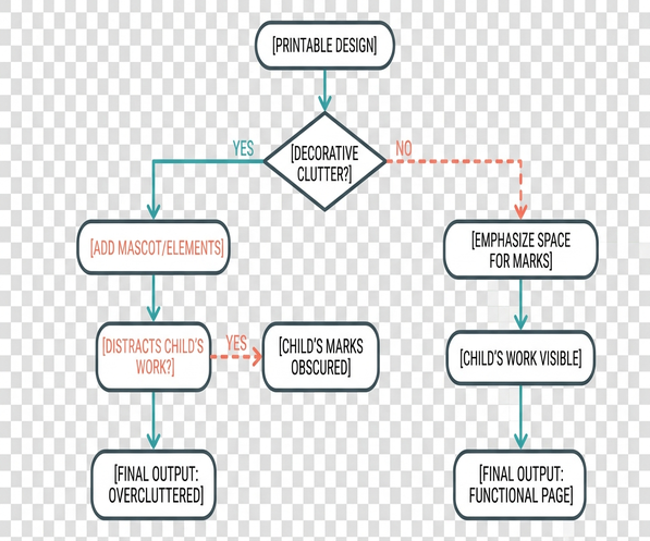
The revision pass runs every cute embellishment through three buckets:
- Instruction — arrows, expression cues, numbered steps, anything that explains the task. These stay.
- Workspace, the blank areas, boxes, and lines where the child responds. These stay, and often grow.
- Decoration, repeated stars, background dots, spare mascots, ornamental frames. These are candidates for deletion.
Story-relevant objects survive the sort. A ball the character is chasing is instruction in disguise; a scatter of confetti behind it is not.
The intimidation problem nobody mentions
A beautifully rendered, fully finished illustration sets a standard. A child holding a crayon can see the gap between that rendering and their own wobbly line, and some of them respond by not starting. A simple line drawing has the opposite effect — it looks unfinished in an inviting way, practically daring the child to colour past the edge and add three suns and a dog nobody drew.
Two checks catch overloaded pages early. Review the artwork at actual print size and in grayscale; if the activity target is not the first thing noticed within two to three seconds, reduce the weight, count, or contrast of everything around it. Then run two short trials of eight to twelve minutes on otherwise identical versions and log observable behavior: hesitation before starting, requests for reassurance, off-task colouring, original doodles.
The Grayscale Pass: What Survives a Home Inkjet
Every ornamental flourish is also a purchase. Families print these sheets on standard home inkjets, and a border-heavy page with solid fills empties a cartridge at a rate parents notice long before they notice the art direction.
The print pass starts by converting the artwork to grayscale and looking for the heaviest ink deposits. Solid colour blocks become outlines. Thick ornamental borders get deleted outright. Essential line art gets kept crisp enough to survive ordinary home output — clean, unbroken, unfussy.
Then a draft prints at 100 percent scale. Fine lines that broke up get strengthened individually. Darkening the entire page to rescue one hairline is how a light, breathable sheet turns into a heavy one.
Line weight, and the tablet trap
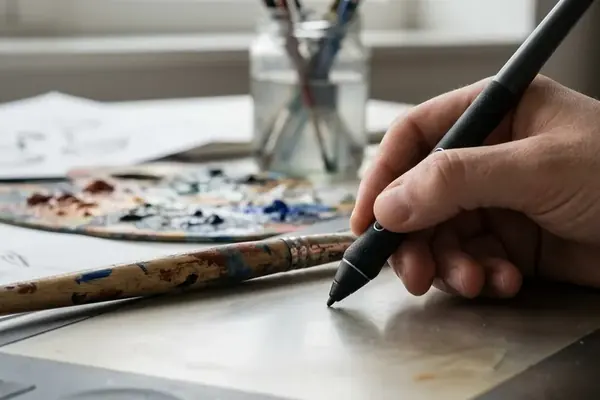
Primary outlines land well at roughly 0.75 to 1.25 point strokes, with large solid fills avoided unless filling them is part of the activity. Pressure-sensitive strokes drawn on a Wacom tablet taper beautifully on screen and then vanish at the tail end on paper, so tapered ends deserve a specific look during the draft check. Verify on real hardware regardless — inkjet output shifts with printer model, paper stock, and driver settings, and no line-weight number substitutes for one test print.
Let the Sheet Rest
Give a fresh inkjet print two to five minutes flat before stacking or colouring it. Then inspect the densest areas for smudging, show-through, and local paper rippling. Thin-line pages come off the tray flatter and dry faster, which is a quieter benefit than ink savings but shows up every single time.
Delete 30 Percent and Watch What Happens
Pick one printable already in the library — ideally a favourite, because favourites hide the most ornament. Duplicate the file before touching anything.
- Count the removable background elements, or group repeated sets so a field of forty stars counts as one decision.
- White-out or delete 30 percent of the graphics that do not explain the task, define an object, or provide space to respond. Budget fifteen to twenty-five minutes for this pass.
- Print both versions under identical settings.
- Hand over the simplified sheet with no coaching, no explanation, no hovering.
- Watch for ten to twenty minutes and write down four things: time to first relevant mark, adult prompts requested, unused workspace, and any drawings or story details the child invents.
About That 30 Percent
The figure is an editing exercise, not a research-backed threshold. Its job is to force real deletions instead of polite nudging of one star into a corner. Some pages will give up half their ornament happily; others will fight for every element, which is itself useful information about how much the decoration was carrying.
Written notes beat impressions here. "Looks cleaner" is a designer's opinion. "Started drawing in eleven seconds, asked for zero help, filled the blank box with a dinosaur wedding" is evidence.
Open the file. Duplicate it. Start deleting — and print both versions tonight so the child gets the simplified sheet cold, with no explanation, while the notebook is already open.







Join the Conversation
Nothing here yet. Add your opinion.
Add Your Thoughts